This tutorial is meant as preparation for a class on Digital Epigraphy I am giving this week and the next. It will explain the basics of vector drawing in Adobe Illustrator. Other tutorials will follow on vector drawing in Inkscape (free! open source!), digital penciling and inking in Photoshop and photogrammetry.
Please note that I am a Windows user, so shortkeys will be different for Mac users. Usually, where Windows uses CTRL, Mac uses Command ⌘. Also, I apologise for using the Dutch version of Photoshop, apparently I need to reinstall it to be able to change it to English.
Before you start, take some time to think a little bit about your subject. What is it you want to capture in a drawing? As the Chicago House’s Epigraphic Survey puts it: “Intact carved wall surfaces and well-preserved painted plaster walls can be recorded quite well with photography alone.” Although I completely agree that photography is probably the best means to show a flat, painted surface, a line drawing almost always complements photography of carved walls. By making a facsmile or line drawing of a carved surface, you are essentially transforming 3D sculpture into a 2D image, which can be very useful to clear all the ‘noise’ and examine the iconography in more detail. During this process, many decisions are made by you, the interpreter.
Photography and photogrammetry
Either way, says the Chicago House method: “Photography is still the first step. First, the wall surface is carefully photographed with a large-format camera whose lens is positioned exactly parallel to the wall to eliminate distortion. A series of photographic film negatives is taken along the length of the wall, each the same distance from the wall, taking care to make sure that the edges of each overlap slightly for joining of scenes later.” Negatives are now mostly a thing of the past. But using a digital SLR camera, a tripod and a tape measure on the floor lying parallel to the wall, it is fairly easy (when space permits) to take overlapping photographs of a wall surface in high resolution. These can then be merged together to form one image using Adobe Photoshop:
Choose File > Automate > Photomerge
Click ‘Browse’ to select and add the overlapping photos
Once the files are loaded, click OK
You can experiment with the different Layout options (Auto, Perspective, etc.)
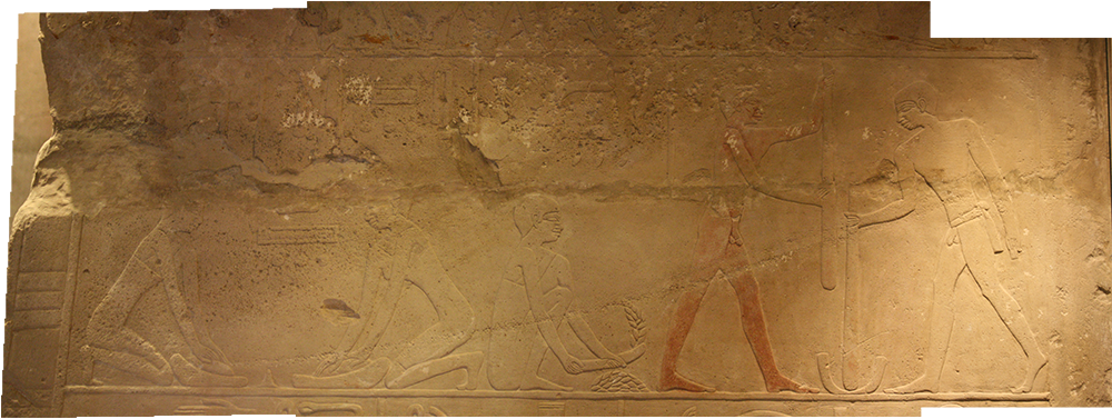
Fig. 1: Photomerge of three pretty aweful photos made in the tomb chapel of Hetepherakhty
Software that gives more control over stitching together photos and correcting the perspective is Microsoft ICE.
A new and awesome way to merge photographs (and acquire a 3D image!) is by using photogrammetry. For this purpose, it is actually vital to take the photos from an angle, rather than parallel to the wall. And this is useful when straight photos can’t be acquired, say in the narrow passage of a tomb, or on a ledge near a steep precipice.
There used to be free beta software by Autodesk to do photogrammetry with, but currently I only know of two paid options:
Autodesk ReCap Photo
Agisoft PhotoScan
There are free trial versions available of this software, and free (Autodesk)/cheap (Agisoft) educational licences. I personally prefer Agisoft, because it looks cleaner and simpler, while giving you more freedom of control.
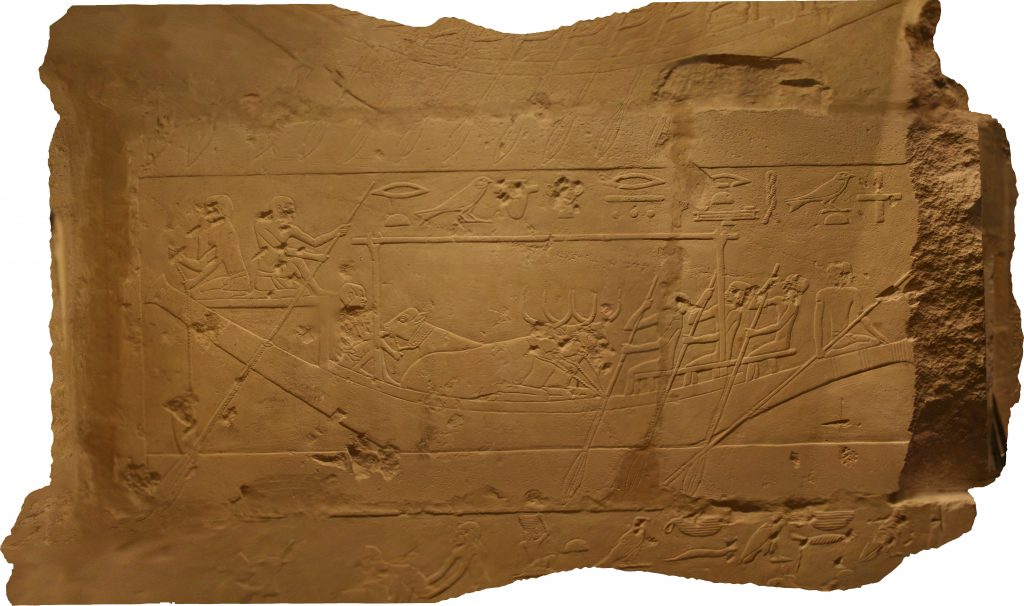
Fig. 2: Orthomosaic of a scene in the tomb of Hetepherakhty
In a different tutorial I will discuss photogrammetry of objects, tombs and wall surfaces.
For now, make sure the photo you’re going to use is as straight, sharp and highly resoluted as possible, allowing you to zoom in to see the finest details. Chicago House used to work with black and white photos, which I will do in this tutorial (a high resolution scan of a century old glass negative, in fact).
Vectors?
A vector line is a mathematically calculated line with a certain direction and magnitude. Raster lines, on the other hand, consist of pixels. If you zoom into a vector drawing, the lines will still be sharp, and hypothetically the graphic can be printed on billboard size. If you zoom into a raster graphic (such as the photo you’re using as a template), you will eventually bump into the little coloured dots that are called pixels.
So why would you, an artist, want to use vectors to draw mathematical lines rather than dip your brush in a pixel paint bucket? Because vectors allow you to change a line long after you’ve drawn it, manipulate it to no end, and print it on any possible size. If you have to draw the scenes of an entire wall, or an entire tomb, vector lines will be your best friends. So let’s begin!
![]()
Fig. 3: Pixel vs. vector line
Getting to know the Pen tool
First, let’s open an empty canvas in Illustrator to practice making vector lines. To do so, open the software and choose File > New and pick any of the templates to begin with. Don’t be put off by all the buttons, icons and options available on the screen. Just click the Pen tool in the Tools menu on the left (or P on your keyboard). At the bottom of the Tools menu you will notice two overlapping squares with colors. When you move your mouse over them, you will see that one is your line colour, the other your filling. For now, we don’t want any filling, just a line. So click on the filling colour and then click on the icon below with the red dash to choose ‘None’. Now you can click somewhere on your white canvas. An anchor point appears, with a blue line trailing behind your cursur. If you click on a second spot, a path will be drawn. You can continue randomly clicking on the canvas to make paths using straight lines. You can close the shape by clicking on the starting point.
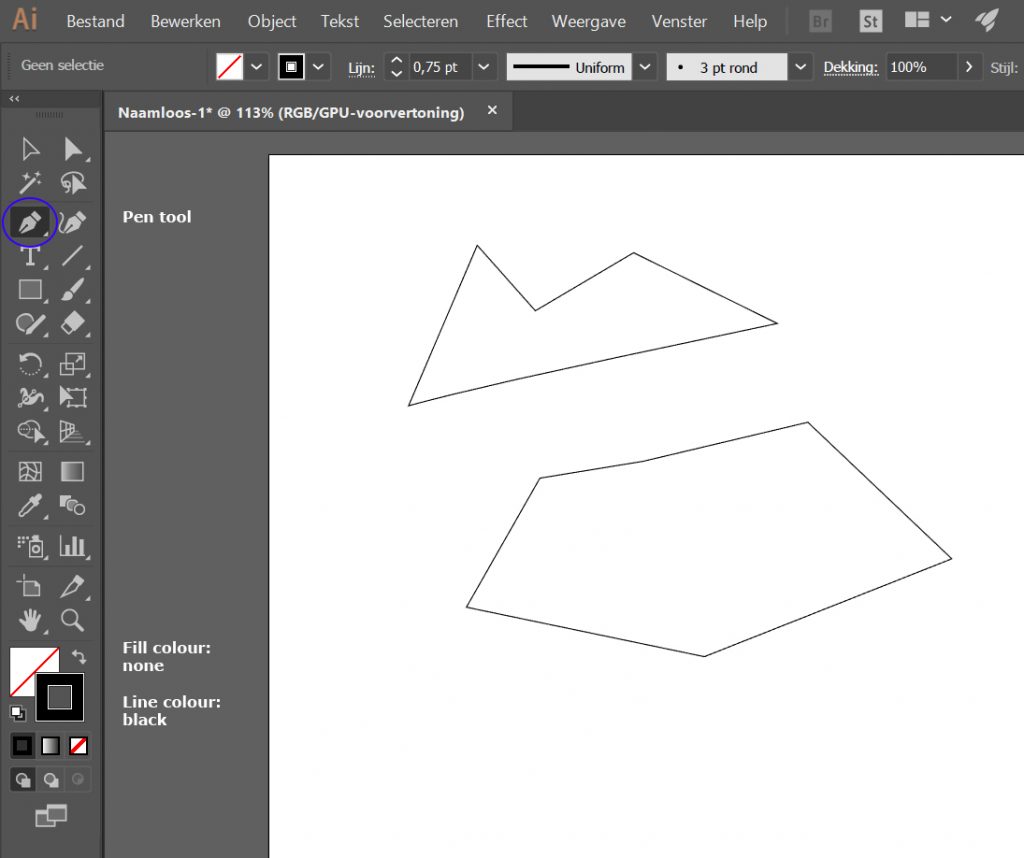
Fig. 4: Making shapes with the Pen tool
Now, you can also make curved lines. To do this, click on your canvas and drag the mouse before letting go. You will see two handles appearing around your anchor point, and the blue line trailing after your mouse will be curved. Click and drag again to make another curve. Repeat until you get the gist. You can either close the shape by clicking on the starting point, or CTRL + click to end the shape but leave it open. If you now choose the Direct Selection tool (the white arrow in the Tools panel or A on your keyboard) and click on any of the anchor points, you will see the handles reappear. You can either click and drag an anchor point to move it around, or click and drag on the handles to change the shape of your curves.
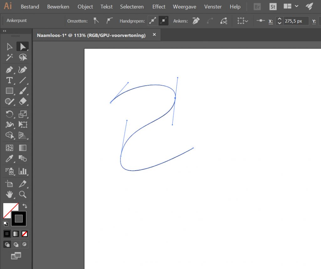
Fig. 5: Making curved lines
More about the Pen tool
Useful tips on editing paths
Now click on the little magnifying glass in the Tools menu (Z on your keyboard) and zoom in to a segment of your vector line. See that? No pixels! To zoom out, ALT + click on your canvas until you’re back at 100% (or the desired zoom level). Another useful key combination is CTRL + Z (Undo), which you will be using a lot.
Drawing in layers
So let’s try the real deal. Open your photo in Illustrator. Make sure your Layers panel is visible (choose Window > Layers) and dock it on the right. Click ‘New layer’, this is the layer you’ll be drawing in. Lock the layer containing your photo by clicking next to the eye symbol, where a small lock will appear. This will prevent you from drawing directly on your photo.
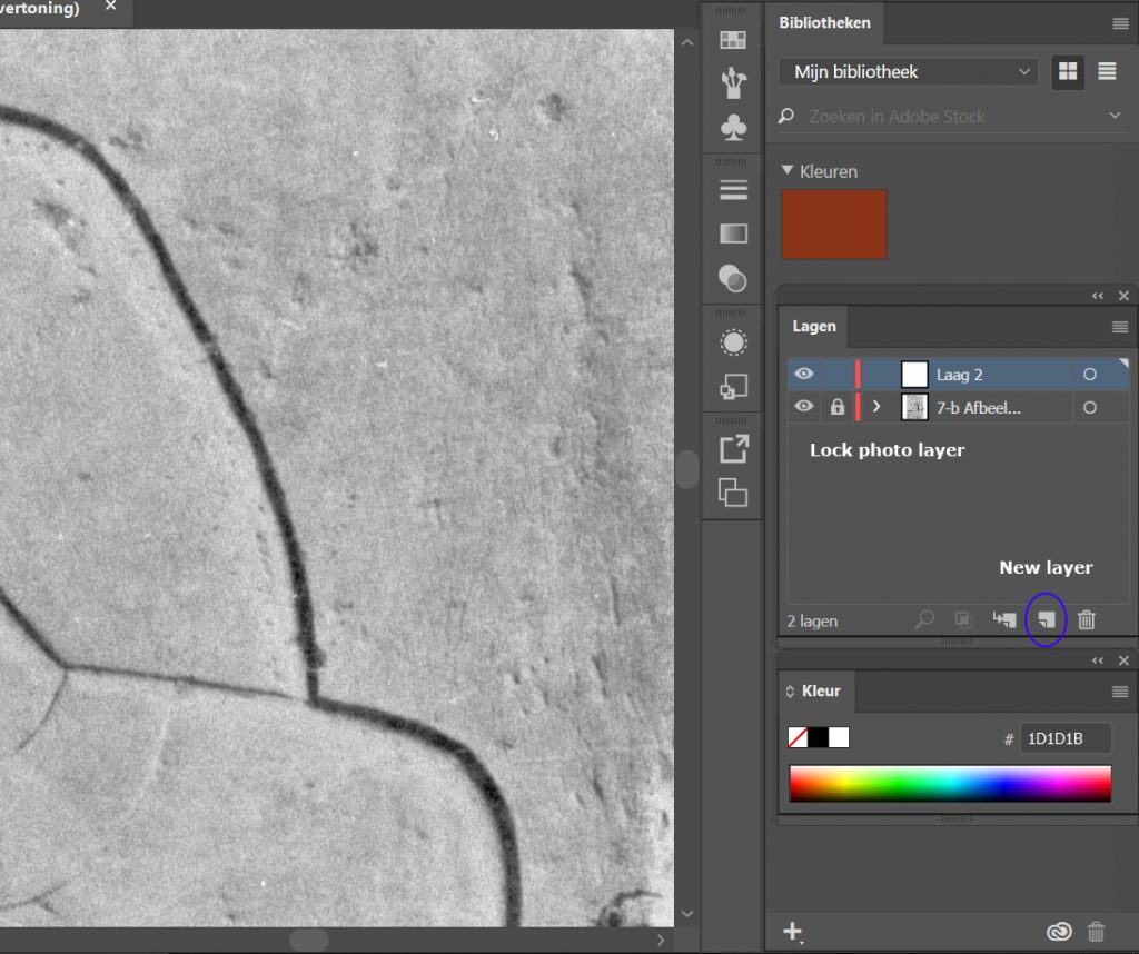
Fig. 6: Creating, selecting and locking layers
Now start experimenting with drawing on your photo using the Pen tool. Remember to again select ‘None’ for the filling colour. If you find the line is too thick, just above your canvas there is a bar with options associated with the tool you’re currently using. The default line thickness is 1 pt, but you can set it as low as 0,25 pt.
But what line should you follow, exactly? A carved line in both sunk and raised relief technically consists of two lines: an upper and lower line. In between is a slope, or bevel. Drawing both of these would not get a desired result. Rather, following the Chicago House method, it is best to ‘split the difference’ and draw your line in the middle:
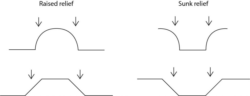
Fig. 7: Splitting the difference
There is no rule as to where to start your drawing. Drawing in the field using permanent markers on perspex, I was taught to first draw the outlines of a fragment for example. But with digital drawing, it’s really just your own call. You could start with the largest figure or the tiniest hieroglyph. Remember you can alter your line thickness according to the detail you wish to apply, or use a lighter grey for lines that are rather modeled than carved (as with this guy’s eyebrow). Chicago House has a whole set of drawing conventions you could use, but I suggest you try to find your own method at first.
It is handy to place your anchor points not at the apex of a curve, but just after the carved line has changed direction. The photo used in this example is actually not perfect, because there is too much shadow in some places to be able to see the bevel and decide which line to follow:
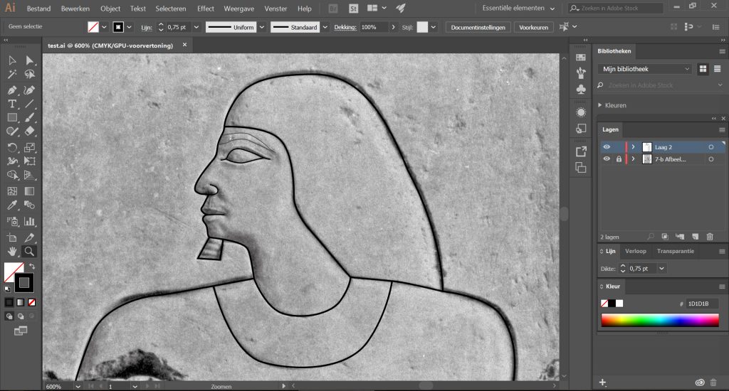
Fig. 8: Hetepherakhty is shaping up
Of course, save your drawing often. It will come in an .ai file format that saves all your layers and vectors. If you want to export your line drawing, click the eye symbol in the Layers panel next to your photo layer. This will just show you the line drawing (or any other layers you might have added, such as damage). Now go to File > Export > Export As and choose your desired file format (.jpg, .png, .tiff, etc.).
Mapping damage
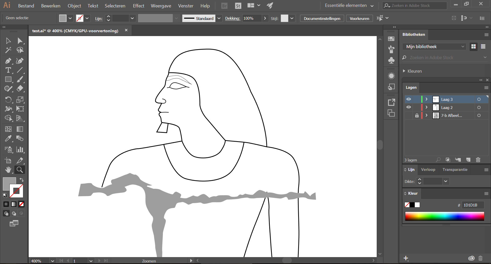
So what about damage? The basic rule is to only show damage where it interferes with a carved surface. Make sure to add a new layer to your drawing in which you store this information. You could choose to give it a light grey filling, for example, with no line colour. In this fast example you can see what that would look like:

Fig. 9: Line drawing and damage
The important thing to bear in mind is that the resulting drawing should not be a study on damage, although it can be useful of course to map chisel marks, intentional damage, plaster repairs, etc.
That’s it for now. The very basics of vector drawing in Illustrator. Based on student experience in class, I will update this tutorial. For now – let’s get drawing!
More on the Chicago House method:
Vértes, K., Digital Epigraphy (2014).
2 thoughts on “Vector drawing in Illustrator”